Contrast and Color
Color is a useful tool for conveying information in a way that can be perceived very quickly by sighted learners. However, this information may not be perceived by learners with visual impairments so it must also be conveyed through another visual means. An example of where color may be used in Page Builder to convey information would be using a red image background to indicate items of high importance.
Contrast is the difference in brightness or luminance between two colors. For example, light colored text may have insufficient contrast against light backgrounds and dark colored text may have insufficient contrast against dark backgrounds. Text and backgrounds of different colors may also cause problems if they differ only in hue but not in brightness. For example, red text may seem to stand out against a blue background, but if the difference is only the hue and both colors have a similar brightness, the contrast may be too low for learners with color vision deficiencies.
In addition to text, if an image conveys information and is not merely decorative, learners need to be able to see the details in order to interpret the meaning of the image. Learners with low vision may find it difficult to interpret images that have low contrast against the background, or between adjacent informational parts within the image itself. For example, a circle used to indicate progress that is a quarter red and three quarters blue may seem to clearly show 75% progress, but if the difference between the two colors is only their hue and they have a similar brightness, the contrast may be too low for learners with color vision deficiencies to see the amount that is filled.
To help you meet accessibility requirements:
- WCAG requirements for use of color
- WCAG requirements for text contrast
- WCAG requirements for Image contrast
WCAG requirements for use of color
WCAG requires that color is not used as the only visual means of conveying information, indicating an action, prompting a response, or distinguishing a visual element.
What you can do to avoid reliance on color
It is okay to use color to make information easier to perceive at a glance, but you should not rely on this. For example, you can still use a red background to indicate the high importance items but you should also add a word such as important in the text.
You can use the Image with Overlay element to make the item accessible.
WCAG requirements for text contrast
WCAG has devised a formula for measuring color contrast between two colors. It requires a minimum difference in luminance between text and background to achieve compliance although it also takes other characteristics into account to produce a contrast ratio. For normal sized text the requirement is a ratio of at least 4.5:1. For large text, the requirement is only 3:1.
What is normal size text and what is large text?
WCAG has different contrast requirements for normal sized text (4.5:1) and large text (3:1). The requirement is less stringent for large text because being large makes it easier to read. The color contrast analysis tools described below give you the results for both sizes.
Within Page Builder, you have the following available to help you address accessibility:
-
In text boxes, the heading styles for Heading 1 and Heading 2 both produce large text which will need at least 3:1 contrast against the background.
-
In text boxes, other heading styles Heading 3, Heading 4, Paragraph, Bullet List, and Numbered List, produce normal sized text which needs at least 4.5:1 contrast against the background. There is one exception. Heading 3, which is normal size by default, is considered to be large text if it is bold. This gives it the less stringent 3:1 contrast requirement.
-
On cards, the Heading 1 style produces large text which needs only 3:1 contrast against the background. The Heading 2 style produces large text if is bold but normal sized text if it is not bold. All other heading styles produce normal sized text which will need at least 4.5:1 contrast.
-
Dynamic elements are fixed and you cannot change the text formatting. The Skillsoft Platform makes sure these all meet the WCAG contrast requirements so you don’t have to test Dynamic cards.
How to measure contrast
There are many tools that can be used for testing the contrast ratios of two colors. Two such tools are:
- The WebAIM Contrast Checker. A web page where you can type in two HEX color values and it will tell you the contrast ratio and whether it meets the WCAG requirements for normal and large text.
-
Vispero Colour Contrast Analyzer. A downloadable Windows or Mac application which does the same thing as the WebAIM Contrast Checker but also provides a color picker tool that enables you to pick colors directly from the screen without needing to know the color values.
How to change text color
To make text a different color:
- After you add the element to your page, select it.
- Select the Edit button. The edit toolbar displays.
- Locate the text that should have a different color, and select the text color button (letter A icon) to change the color.

Special consideration for Image with Overlay
There is one type of Page Builder object that needs special consideration, the Image with Overlay. This allows you to change the background image, the overlay color, the transparency of that color, the paragraph text color, and the text position. The result is a massive possible variation of contrasts between and within cards. To meet the contrast requirements, every letter of the text must meet the requirement against every part of its background.
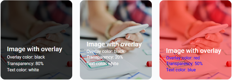
Because you can choose any image for the background, the contrast of the text against different areas of the image may vary greatly. In the second card of the above example, some of the white text is against a partly red or green background and some is against an almost white background. The transparency setting changes all of those colors between completely white at 0% transparency to totally black at 100% transparency. When the transparency is low, the whitest parts of the image may contrast with the text by under the required 3:1 ratio. In this example, the contrast of the white on light grey at 20% transparency is under 2:1 so it does not achieve WCAG conformance. Furthermore, if the learner resizes the page, the position of the text against the image will change so you cannot even guarantee what part of the image the text will overlay. For this reason, it is necessary to use a contrast checker with a color picker tool to test the actual contrast of every part of the text and then change the image, overlay color, transparency, text color, or position until you achieve compliance.
WCAG requirements for image contrast
WCAG has devised a formula for measuring color contrast between an image and its background or between colors in the image. It requires a minimum difference in luminance of 3:1 between adjacent colors to achieve compliance.
How to measure contrast in images
The Vispero Colour Contrast Analyzer is a Windows or Mac application which provides a color picker tool for selecting colors directly from an image or its background. It will then tell you the contrast ratio between the two colors and whether it meets the WCAG requirement.
Tips for informational images
When using information images, there are a few things you can do to make it easier to achieve WCAG compliance:
- Use simpler images. Images with a lot of different parts that must contrast against each other will inevitably be more difficult to make compliant.
- Reduce the number of colors used. Again, the more colors that need to contrast, the more difficult it will be.
- Add text to convey the information. For complex images such as bars and charts that you cannot make compliant, you may need to convey the same information in text. But not just text within the image, as this will contravene another WCAG requirement, Images of text. The text would have to be alongside the image in a readable form that meets the contrast requirements.