Edit Page Designs
You can edit your custom pages at any time to ensure they continue to fit your organization goals and objectives.
You can also manage your page hierarchy and visibility at any time. This includes renaming pages and adding new subpages.
Edit a Page
To edit a page:
- From the left navigation bar, select Learning > Page Builder. The Page Builder page displays.
- Locate the set of pages you want to edit and select it to open it in Page Builder.
- The Page Builder displays with two tabs on the left side:
- Pages: This tab shows all the pages associated with the template. From the Pages tab, and the actions menu
 to the right of each page, you can:
- Rename a page: Change the name of the page as it displays in the left navigation to learners.
- Delete a page: Remove the page from the site.
- Copy link: Get the URL to paste into another website or email notification.
- Add a subpage: Add a new page to the hierarchy.
- Select a page to start editing or deleting the existing components.
- Design: This tab is where you can add new components to the page that is selected.
- When editing a page, you can:
- When editing your page hierarchy, you can:
- As you are editing your page, you can save it at any time. Select Save to save your changes. If you make a mistake you can select the Undo arrow or the Revert button. Revert undoes all changes back to the last time you saved.
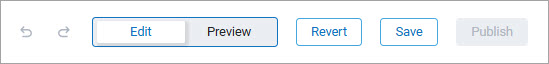
- To see how your page will look to learners, select the Preview button.
- When all is as you like, you can add languages if you want to offer the pages in a learners local language. If you have previously added languages and make changes to one language, do not forget to make the same changes to other language pages to keep them consistent if you want.
- When all is as you like, you can publish the page so learners can see it. Select Publish.
- Follow the five-step publishing process.
From the Pages tab, select the page you want to edit, then select the Design tab so all features are available. The page displays in the main window on the right so you can edit it.
Edit contents of components
To edit any component, except the divider:
- Select the component from the main window to the right. Icons display across the top of the component.
- Select the edit icon. It is the one to the left of the trash can icon. You can also double click within the component to open the editing options. Each component has its own set of data you can edit.
-
The character limit for text boxes is listed in each component inline and may change depending on the column width of the component. Edit one of the following types of components:
 Text
Text
The basic Text component contains only text or hyperlinks. Use this component when you want to add a heading or descriptive text to the page, or link to another page or site.
When you edit a Text component, the editor displays inline.
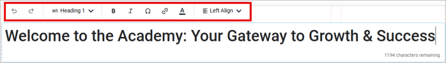
You can:
- Change the existing text and add your own.
- Add multiple lines of text, up to the character limit displayed in the text box.
- Change the style line-by-line by selecting Heading 1, 2, 3 or paragraph from the drop down.
- Change the alignment line-by-line by selecting from the Align drop down.
- Change individual character formatting within a line to bold or italic.
- Insert special characters.
- Add a hyperlink to all or part of the text.
- Undo text changes while in the editor. If you leave the editor, your changes are automatically saved. To undo any text changes after you leave the text editor, you can revert to your last saved changes at the page level.
- This component allows for 1250 characters no matter the column width.
Image
The Image component allows you to add an image or animated GIF to your page. The image can contain a text overlay and be used as a hyperlink. Use this component when you want to add graphical elements to the page. You can also use this component to link to a subpage or another URL.
When you edit an Image component, the editor displays as a pop-up. Choose whether you want a Plain Image or an Image with Overlay. If you are using an animated GIF as your image, we recommend a plain image. You can go back and change this at any time by selecting Back to image style selection from the bottom of the editor pop-up window. Within the pop-up, you can:
- Change the existing image by browsing to an image file location or choosing from the Skillsoft image gallery.
- Add Alt Text which is a description of the image to help visually impaired learners understand its contents.
- Add a Target URL so when the learner clicks on the image, they are brought to a different page. This could be a target URL of a subpage. Choose whether you want to target URL to open in the same tab or a new one.
- If the image was set up as an overlay image, you also see these options:
- Overlay color: This is the color that overlays your image so that any text you add stands out more.
- Transparency: This is how dark you want the overlay color to be. Enter a value between 0 and 100. The higher the value, the darker the color and the less the image stands out.
- Heading text: Enter text here that shows over the image. You can leave this field blank. Text entered in this box displays similar to Heading 2 in the Text component. You cannot change the style or formatting of the text. You can add up to 120 characters no matter the column width.
- Paragraph text: Enter text here that shows over the image. You can leave this field blank. Text entered in this box displays similar to the paragraph style in the Text component. You cannot change the style or formatting of the text. You can add up to 180 characters no matter the column width.
- Text position: Choose where in the image you want the text to display. Both the heading and paragraph text must go to the same location. Heading text always displays above the paragraph text.
Static cards
Static cards allow you to add specialty elements to your page that contain a combination of text, images, and buttons. You can add a hyperlink to an image or a button that takes the user to any web page. Use these cards when you want to add variety and dimension to your page. You can also use static cards to link to subpages within your hierarchy. If you want to link to content contained in your Skillsoft Platform site, we recommend using dynamic cards instead of static cards.
When you edit a static card, the editor displays as a pop-up. Depending on the type of static card, the pop-up may contain the following fields:
- Image: When the card contains an image element, change the existing image by browsing to an image file location or choosing from the Skillsoft image gallery.
- Alt Text: When the card contains an image element, add a description of the image to help visually impaired learners understand its contents.
- Target URL: When the card contains no button element, you can add a target URL so when the learner clicks on the image, they are brought to a different destination. Choose whether you want to target URL to open in the same tab or a new one.
- Heading text: Enter text here that shows in the card. Text entered in this box displays slightly smaller and bolder than the paragraph text in the basic Text component. You cannot change the style or formatting of the text. The character limit changes depending on the column width of the component.
- Paragraph text: Enter text here that shows over the image. Text entered in this box displays slightly smaller than the paragraph style in the basic Text component. You cannot change the style or formatting of the text. The character limit changes depending on the column width of the component.
- Button text label: Add text that shows on the button displayed within the card. A good rule of thumb is to make the text action-oriented, such as, View recording or Launch course.
- Button target URL: When the card contains a button element, add a target URL so when the learner clicks the button, the action happens. Select whether the action happens in the same browser tab or a new tab.
Dynamic elements
Dynamic elements allow you to showcase content directly on the page. You can link to Library areas and subjects, channels and journeys, or specific content items. Dynamic content cards automatically update if the content is updated.
There are four different dynamic elements you can add to your page:
-
Dynamic card
Dynamic cards allow you to link to a specific Skillsoft or custom content item.
To add content to your dynamic card:
-
Select the edit icon on the card. You must first select the type of content you want to add. Your choices are:
- Area
- Subject
- Channel
- Content item
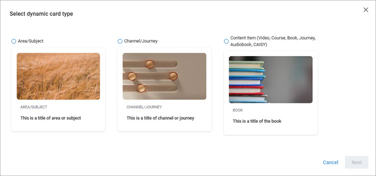
- After you select the type of content to add, select Insert.
- Search and select from the list to add the item. If you created any custom areas, subjects, channels, journeys, or content items, you can select those as well as Skillsoft items from the list.
- Select Add content. The card is updated with the selected content type, title, and image.
-
-
Dynamic Strip
Dynamic strips contain multiple dynamic cards and update automatically with relevant content for the learner.
When you edit a dynamic strip, the editor displays as a pop-up.
- Choose from one of the four different dynamic strip templates:
- Top picks for role: Displays content tailored to the learner's role.
- Based on skill interest: Displays content specific to the learner's selected skill interests.
- Recommendations for learners: Displays content tailored to the learner's profile.
- Learner activity: Displays content that the learner has already started.
- Select Customize.
- Complete the following fields for the dynamic strip you chose. Note, the fields differ based on the type of strip you selected.
- Tabs: Choose which tabs you would like to show in your dynamic strip. Learners can switch between tabs to see different content in each. If you are creating a Based on skill interest strip, choose how many tabs you would like learners to see. In this case, the different tabs correspond to the learner's selected skill interests.
- Number of cards per tab: Choose how many content cards show in each of the dynamic strip's tabs.
- Choose from one of the four different dynamic strip templates:
-
Promoted Content Strip
If you choose to add a promoted content strip, you select from your custom content strips that have already been created on the Content Promotions page.
When you edit a Promoted Content Strip, the editor displays as a pop-up. From the drop down, select which content strip you would like to add. Then click Select.
-
Promoted Banner
If you choose to add a promoted banner, you select from your custom banners that have already been created on the Content Promotions page.
When you edit a Promoted Banner, the editor displays as a pop-up. From the drop down, select which banner you would like to add. Then click Select.
Delete components
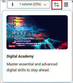
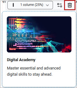
- Select the component from the main window. Icons display across the top of the component.
- Select the trash can icon to delete the entire component and all its contents from your page. The only way to get a deleted component back is to Undo or Revert to your previously saved version.
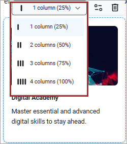
Change the Column Width
You can edit most components to fit from one to four column widths wide on your page. This allows you to add variety and dimension and make the page visually appealing. It also helps you to guide your learners to where you need them to go.
To change the width of a component:
- Select the component from the main window. Icons display across the top of the component.
- Select the Column width drop down. If you do not see the Column width drop down, you cannot change the width of that component.
- Select how many columns wide to make the component. Some types of Static cards must be at least 2 column widths wide. Also, the character limits for Heading and paragraph texts in Static cards change based on the column width. If you attempt to decrease your column width and have too much text, you see a prompt explaining that in order to decrease your width, you have to decrease your character count.
Add a new component
You can add as many components to your page as you want. You can edit the contents of all components after you add them to your page. Use a variety of components to create interest and guide the learner.
There are many types of components to choose from:
- Text: The basic Text component contains only text or hyperlinks. Use this component when you want to add a heading or descriptive text to the page, or link to another page or site.
- Image: The Image component allows you to add an image or animated GIF to your page. The image can contain a text overlay and be used as a hyperlink. Use this component when you want to add graphical elements to the page. You can also use this component to link to a subpage or another URL.
- Dividers: Dividers add a visual dividing line to help you create sections to your page. You cannot edit or format the look of dividers.
- Static: Static cards allow you to add specialty elements to your page that contain a combination of text, images, and buttons. You can add a hyperlink to an image or a button that takes the user to any web page. Use these cards when you want to add variety and dimension to your page. You can also use static cards to link to subpages within your hierarchy. If you want to link to content contained in your Skillsoft Platform site, we recommend using dynamic cards instead of static cards.
- Dynamic: Dynamic elements allow you to showcase content directly on the page. You can link to Library areas and subjects, channels and journeys, or specific content items. Dynamic content cards automatically update if the content is updated.
To add a component:
-
From the Pages tab, select the page to which you want to add a component, then select the Design tab so all features are available. The page displays in the main window to the right so you can customize it.
-
Locate the component you want to add from the Design tab, click and drag it to the place within the page you want it to display. If it lands in the wrong place, simply click and drag it to the right place. Other components may shift to accommodate the new component.
-
Once the component is placed on the page, you can edit its contents or change its column width.
Add a subpage
To add a subpage:
- From the left navigation bar, select Learning > Page Builder. The Page Builder page displays.
- From the Your pages at a glance section at the bottom, select the main page to open it in Page Builder.
- From the Pages tab, locate the higher level page and select the action menu , then Add subpage.
- Enter a unique Page title. The subpage is added below the page selected. Customize it as needed. You can reorder the subpages that are under the same higher level page by selecting and dragging the 6-dot icon
 . You cannot change the level of a subpage. You can copy its link to add to a Static card on your main page so learners can navigate to the subpage. The hierarchy structure of the subpages displays in the left navigation if you choose to show the main page in the left navigation.
Rename a page
To rename a page or subpage:
- From the left navigation bar, select Learning > Page Builder. The Page Builder page displays.
- From the Pages at a glance section at the bottom, expand the main pages to find the page you want to rename.
- Select the main page to open it in Page Builder.
- From the Pages tab, locate the page and select the actions menu , then Rename.
- Enter a new name in the Page title line. This is what displays to learners in the left navigation.
Add languages
To add languages so learners can view your pages in their local language:
- From the language drop down, select Manage display languages.
- Select all languages that you want to offer for this set of pages.
- Select Save.
- From the language drop down, select one of the newly added languages.
- In the pop up that displays, choose either Auto translation or Manual translation. You only see the option for Auto translation if you admin has it enabled. If you select Manual translation, the platform makes a copy of the pages so you can edit the copy yourself; save them when you are done. If you select Auto translation:
- Select, Next, reserved words.
- Identify any words that should not be translated. These may be names or technical terms. The platform makes suggestions, but you can choose to edit the list. Select the X next to a word to remove it. Type a word + enter to include it.
- Select Next, select pages.
- Identify all the pages to translate. By default, all pages in the set are translated.
- Select Confirm. The platform creates a copy of all the pages and provides translations. The translation may take a while to complete. You can return to the Page Builder to continue working.
- After the translation is complete, you can use the language selector at the top to switch to the pages in that language. Review the pages and make any edits necessary. At this point, if you want, you can also change the design components.
- Save your changes.