Resize and Reflow
Learners with visual impairments may need to increase the size of text and images, up to 400% bigger or more, in order to be able to read and understand content. They can do this using the zoom function of their web browser or by using screen magnification software. When the page is zoomed, the content becomes bigger so less can fit into the available space. When zoomed to 200% only half as much content can fit.
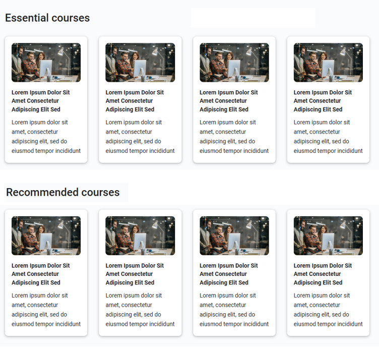
As the content zooms, it reflows to fit into the reduced space. Lines of text get shorter as text wraps onto the following line. At larger zoom levels, this can result in very short lines of text which are difficult to read so the Skillsoft Platform rearranges the layout of the page, changing the four column layout to a single column, as shown below. The image below shows how the screen appears on a standard laptop screen 1,400 pixels wide. All four columns fit into the available width.
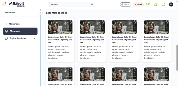
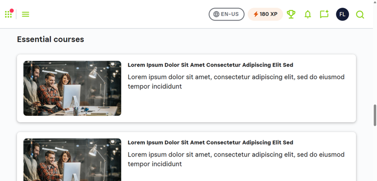
The image below shows what happens when the same page is zoomed to 150% of normal size. The Skillsoft Platform automatically adjusts by closing the left sidebar to save space and reducing the four columns to one column with wider cards, so text is easier to read.
Consider this design and how it looks when you zoom:
-
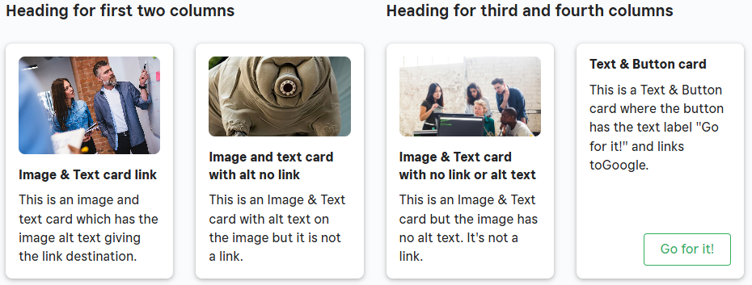
The image below shows a page that has two headings on the same row, each with two cards underneath it in a column format. The image below shows how the screen appears on a standard laptop screen 1,400 pixels wide. All four columns fit into the available width.
-
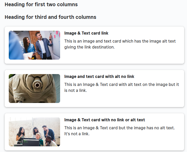
When this page is zoomed to a level where Percipio rearranges the content, the result is that the two headings now come before all of the cards and the information about which courses fall under each heading has been lost. This is very similar the reading order problem described in the section on Reading Order.
WCAG requirements for resize and reflow
WCAG requires that text can be resized up to 400% without loss of content or functionality and that it reflows in a way that doesn’t require horizontal scrolling. Percipio handles the reflow requirement by rearranging content. No content is actually lost in this rearrangement so this does not actually introduce a WCAG non-conformance. But the meaning can be lost if not designed correctly so the effect on learners is very serious and layouts like the one above should be avoided.
How to layout pages to avoid resize and reflow issues
Page Builder doesn’t have any facility to allow you to specify explicit content groupings for column-based layouts that can be used to ensure meaning is retained when rearrangement occurs in situations like this.
To ensure that the meaning is retained you cannot therefore have different headings for different columns. You would have to put each heading on a separate line and place only the relevant cards under each heading.